MERCEDES-BENZ | VEHICLE PURCHASE PROCESS
Streamlining the Mercedes-Benz Vehicle Purchase Experience
Mercedes-Benz Financial Services customers were managing a multi-state title and purchase process through a two-tab document system and an email message center — with no clear indication of where they were, what was missing, or what came next. I led UX from discovery through delivery, replacing that fragmented experience with a guided stepper that gave customers a single source of truth for documents, status, and next steps.
My Role
- Owned the full design process: journey audit → wireframes → prototype → stakeholder sign-off
- Mapped the existing flow across 4+ states to identify where customers were losing track of documents and progress
- Aligned product, engineering, and legal on a single flow that worked across state-level regulatory variations
- Designed and iterated the stepper UI in Figma, validating clarity of status indicators with real users
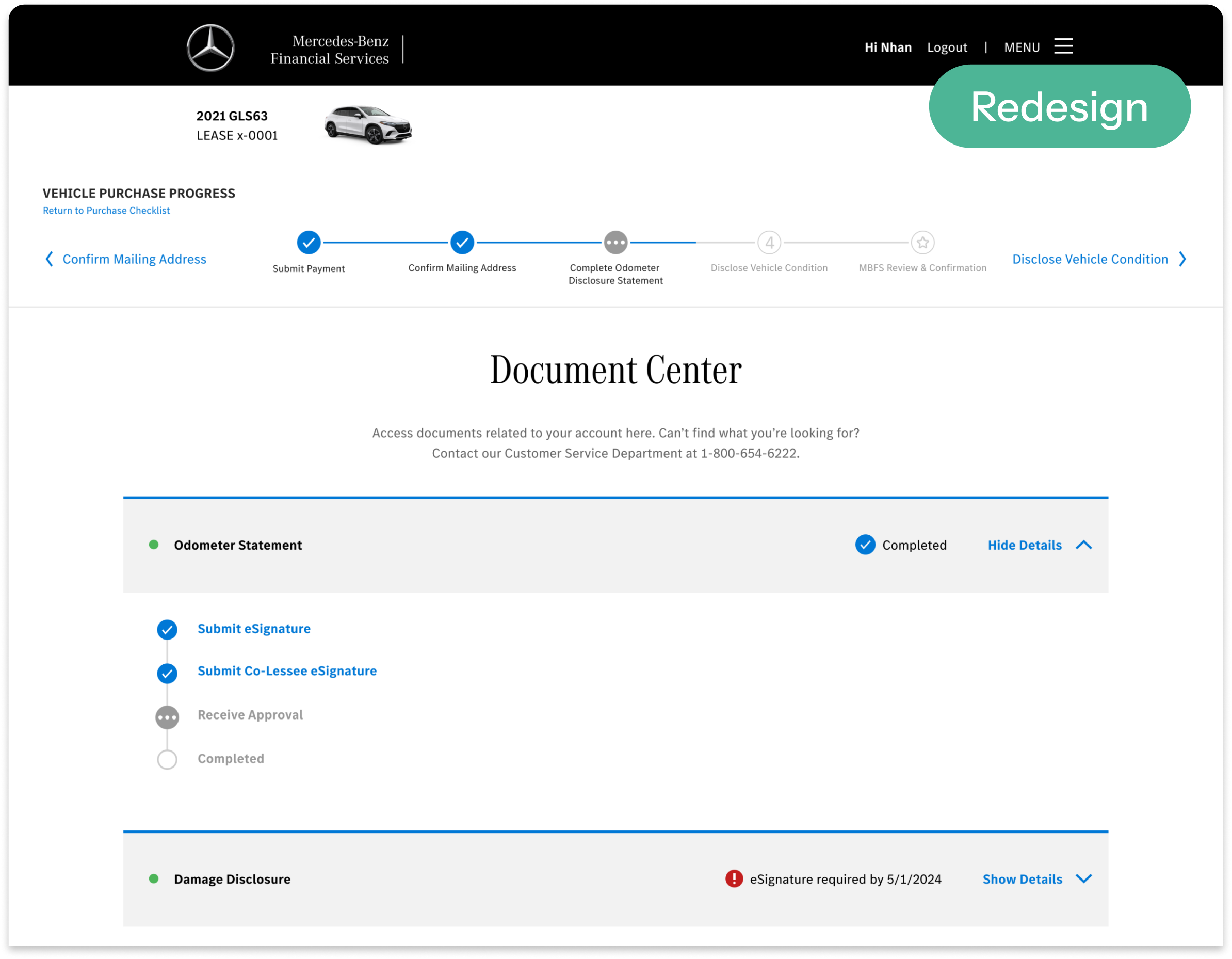
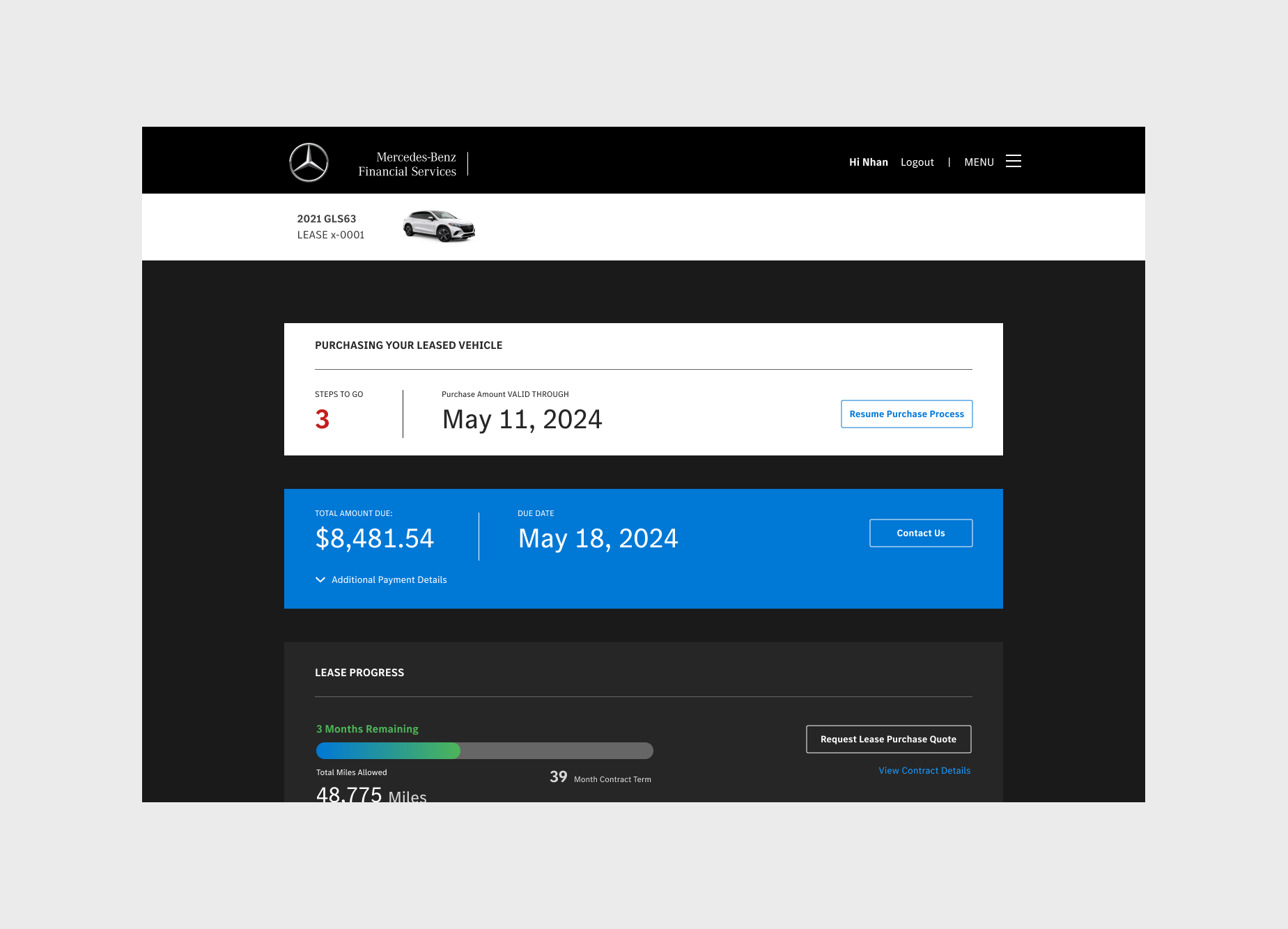
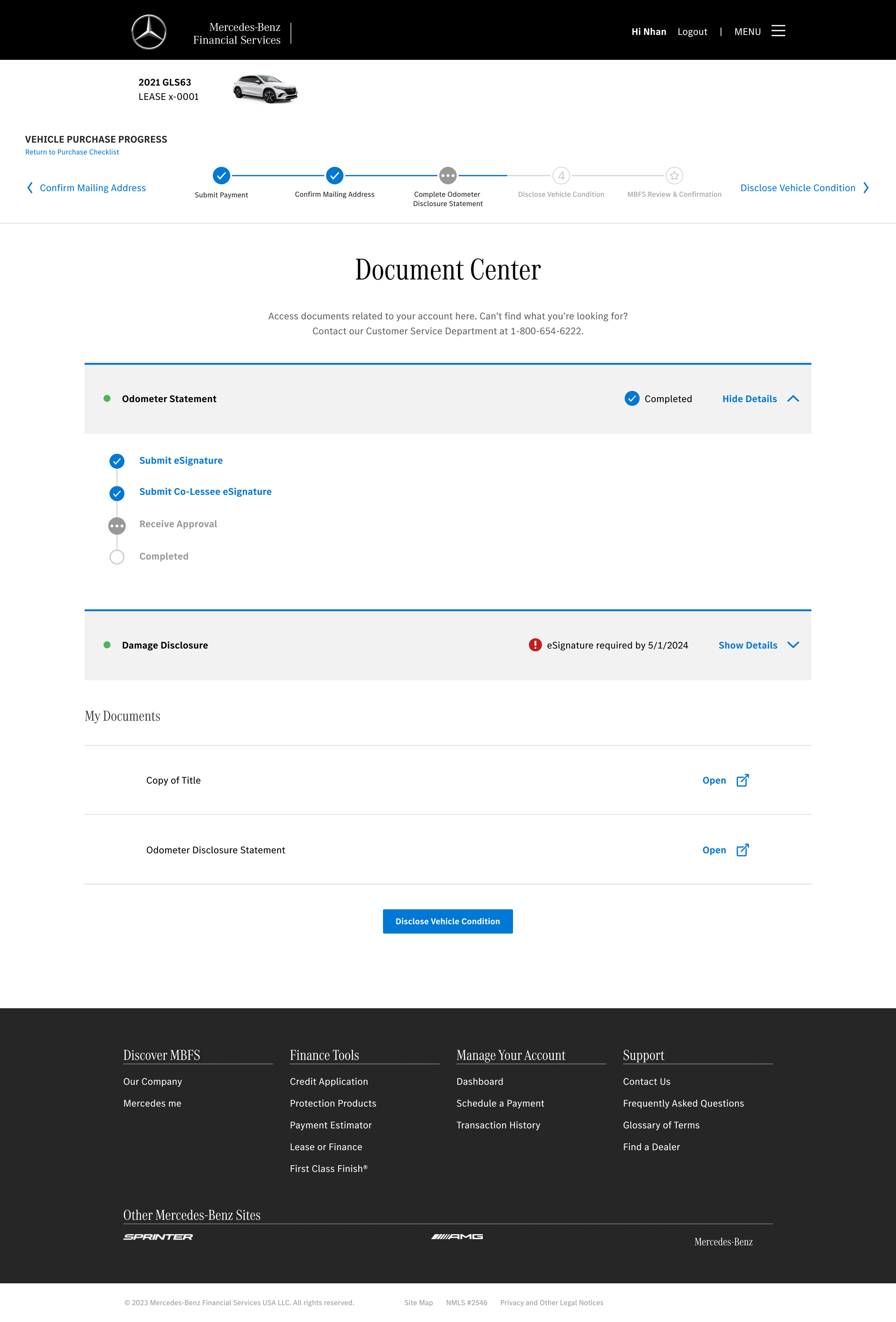
After: Guided Purchase Process
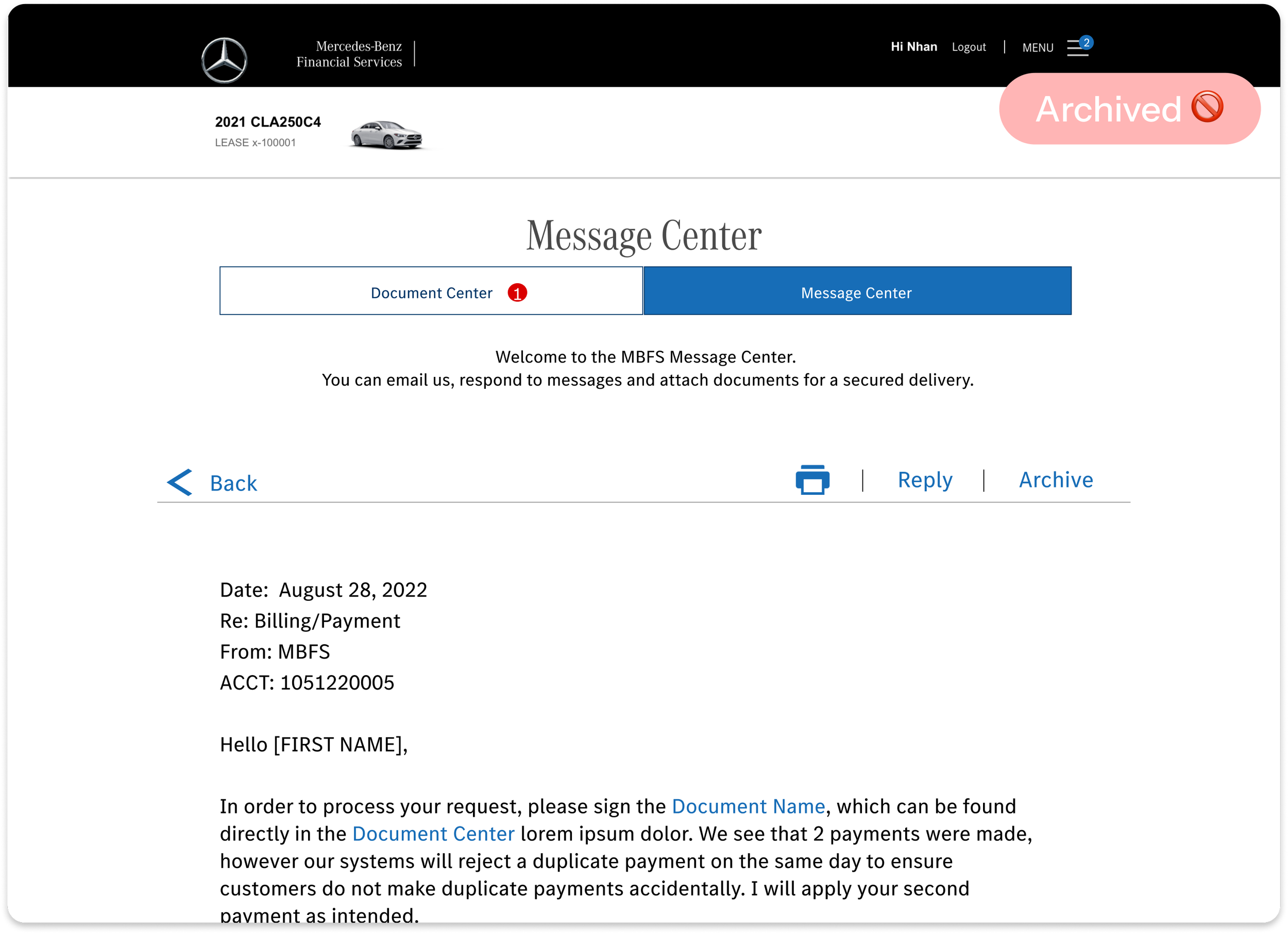
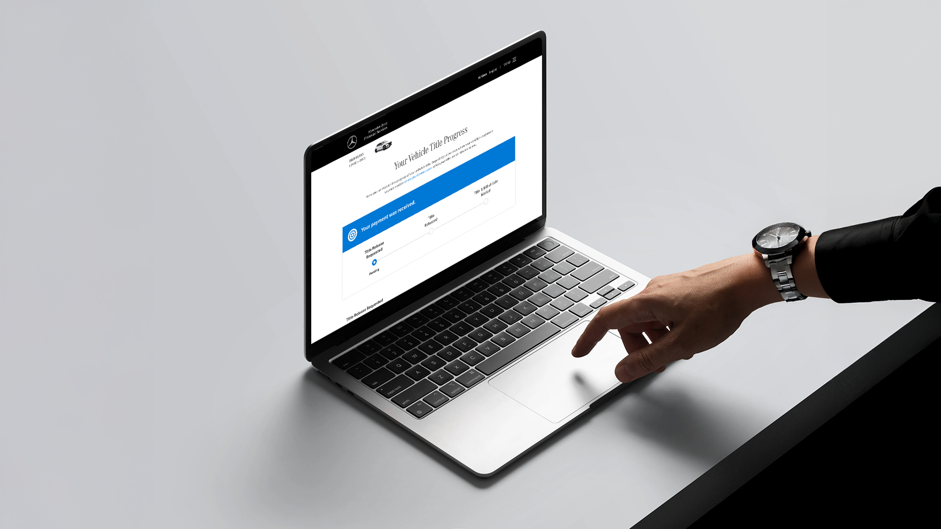
Before: Document and message center only
The ProblemUsers lacked clarity on where they were in the vehicle purchase and title process, leading to confusion and drop-off.
The experience varied significantly by state due to different legal requirements, resulting in inconsistent expectations and increased support calls.
Discovery 🔍
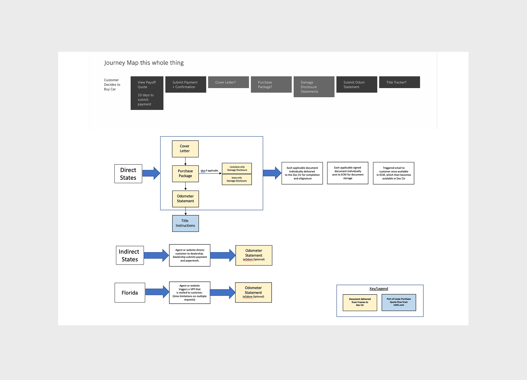
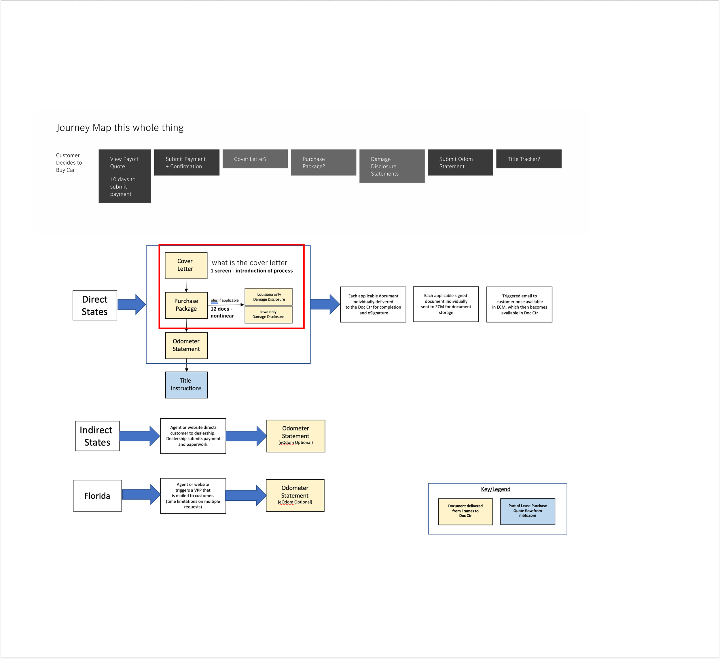
To understand the complexity of the title and purchase process, I mapped the end-to-end journey across state-specific flows and validated through stakeholder interviews. The journey map image below highlights variations in approval flows and title processing across states.
- Users did not have a clear mental model of the process or their current status
- State-specific variations created inconsistent and unpredictable experiences
- Approval steps lacked transparency, leading to uncertainty and support calls
- Internal teams had misaligned understanding of the actual user journey
Define 🧠
Problem Framing
How might we create a clear, consistent experience that adapts to state-specific requirements while reducing user confusion?
Success Metrics
- Reduced support inquiries related to title status
- Reduced ambiguity in a complex multi-state flow by consolidating document tracking and status updates into a single guided experience.
- Stakeholder feedback confirmed the redesign addressed the core pain points identified in discovery.
Design ✏️
Approach
I explored multiple flow directions to simplify the experience while accounting for state variability, focusing on improving clarity, transparency, and user confidence.
Iterations
- Started with simplified linear flows → evolved into conditional flows based on state requirements
- Introduced clearer status indicators and step visibility
- Refined information hierarchy to reduce cognitive load
Key Decisions
- Prioritized transparency over minimalism to ensure users understood their status
- Designed flexible components to handle state-specific variations
- Balanced system constraints with user clarity
Validate 🧪
Validation
- Prioritized transparency over minimalism to ensure users understood their status
- Designed flexible components to handle state-specific variations
- Balanced system constraints with user clarity
What Changed
- Simplified language and labeling for better comprehension
- Adjusted flow visibility based on confusion points
- Improved status indicators to reduce ambiguity
Impact
Customers went from managing their purchase across two disconnected tabs and an inbox to a single guided experience. One place for every document, every status, every next step.
Created a scalable title-tracking framework that improved transparency for users, reduced ambiguity in complex state-specific workflows, and aligned internal teams around a clearer end-to-end journey.
Customers went from juggling two disconnected tabs and an inbox to a single guided experience. One place for every document, every status, every next step.